Read the article on Medium.com
If you asked anyone to draw a face, chances are that they would include two eyes, and perhaps just a mouth.
Some depictions of faces: one on a 17th century tombstone, another by a three year old, a third on a doughnut and the fourth a ubiquitous emoji from our every day life.

Left to right: Tombstone 1736, American Antiquarian Society Collections/Farber Gravestone Collection; Drawing Gavi R., age three; Doughnut, Stocksnap; Winking Emoji, Copyright Artrosestudio | Dreamstime.com
All of these artists distilled their subject into the most essential information needed to describe a face. The psychologist and neuroscientist Stephen Kosslyn, among others interested in facial recognition, know this empirically through their research: Eyes, for example, are a key feature that make a face a face. Whether by naive approach, intuition, or sophisticated distillation, artists select the minimal elements that describe a face and translate them into visual notation.
Memorable logos or symbols are instantly “read” and understood. They capture precisely the elements needed to convey the intended specific meaning. Today many of the devices or tools used in everyday life are smaller than ever and the visual iconography they display can be complex. And yet, we, as users of these devices, must be able to “read” them unambiguously.
While working as a designer at Wang labs in the mid 1980s — when digital information design was in its infancy, when the Mac was but a twinkle in Lisa’s eye and when it was Xerox, not Apple, that was at the forefront of user interface design — I was charged with designing a set of 45 icons for Wang’s office operating system. These icons would represent the various software applications on the system’s user interface. We had a 64 pixel square target area and a primitive editor that could turn a pixel on or off. While the technical limitations were clear, it was, as I argued at the time, the conceptual framework that was the primary problem in developing good icons. The set was simply too big for users to be able to make useful distinctions. The differences between the “named” icons were conceptually too fine (for example, there were to be 3 different icons for database alone: one for a database report, one for a query and one for database help). While this project floundered, the exercise clarified for me the many levels of distinction needed for clear and unambiguous icons.
But how do readers and designers recognize which cues will help decode the message?
Linguists, psychologists and literary scholars have sliced and diced signs, assigning to them a variety of semiotic categories based on the relationship between what the sign looks like and how its meaning is derived. It was the enigmatic philosopher and mathematician Charles Sanders Peirce whose understanding of signs had the most direct significance for designers. His categories of icon, index and symbol describe the relationship between the picture and what it represents — whether it is a direct representation of a thing (icon), an idea about that thing (index) or a more derivative and indirect way of conveying its meaning (symbol). The ultimate success of a sign is not limited by the kind of sign it is, but how strong the connection between its content and its form.

The author’s Prius dashboard and the icon from the user manual.
I was driving to work when I noticed an icon lit up on my dashboard. What did it mean? I had no idea. I ignored it for a while because I couldn’t “read it”. After resorting to the manual, I learned this was a picture of a tire that was under inflated. What was wrong with this icon? If you ask three year olds to draw you a tire, is it possible that their drawings would be anything other than a circle? So why did the designer of this icon use the head-on “frontal” view of the tire? The inclusion of an emphatic exclamation point in the center of the tire further obfuscated the picture of the tire.

Left to right: Nick Cowie,FreeImages; Petr Kovar,FreeImages; Magda Ehlers,Pexels; Richard Styles, FreeImages.
Nothing could say tire less. It is the “profile” view in this case that captures the most critical and distinctive feature of a tire. Ask any three-year-old. A tire is round!
It turns out I wasn’t the only one to find the design of the tire symbol unclear. Mike Zender and Alyssa Strauss, both professors at the University of Cincinnati, also cite this icon as an example of one whose information is not easily understood (“Design by Consensus: A New Method for Designing Effective Pictograms”, Visible Language 51:2). They conclude that it is important not only for the reader to have prior knowledge of thing or action, but that the depiction of the information be well conceived.
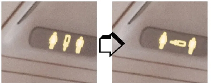
Before and after seat belt icon is rotated.
Another trip, this one on a plane. I knew the icon that was blinking above me was telling me to fasten my seat belt, but the picture was amusingly odd. It actually looked like a toilet. Why was the “read” so difficult? The reason was two-fold. First: the seat belt was rotated into an unfamiliar orientation. And second: the relative sizes of the people compared with the seat belt was switched. Seat belts go across our waists. Because we think of our waists as going across our bodies, the orientation of this symbol was inaccurate, thus removing it from common association. Simply rotating the symbol so that its orientation reflects the way it is used makes it easier to read.
Perhaps all this points to the designer’s corollary of Occam’s Razor. Formally translated as “Entities must not be multiplied beyond necessity”, it is commonly understood to advise taking the simplest route to an end. Designing easily read symbols requires identifying a simple or singular meaning of an idea and translating it into the most straightforward visual interpretation. When in doubt ask a nearby preschooler.